Getting the size right.
WHAT IS YOUR ADVERT FOR?
It may seem a simple question, but it isn’t always.
The first question that we ask any potential advertiser is ‘what do you do?’ and generally, that gives an insight into what your advertising needs are.
If you are promoting a one-off event such as a sale, gig, or new pub menu launch, then going big and bold is generally a good call. If, however you are a tradesperson looking for regular work over a long period of time, then a full-page advert can feel expensive every month, and we would recommend a smaller advert. Potentially in more magazines.
Matty says “For most businesses, from experience, regular advertising in the magazine is what works best. As the magazines are monthly, readers can see a service in a magazine that they don’t need today but do in the future. The ideal scenario is when our readers know that they can find the service that they want in the magazine when they need it, and we see it in action often”.
“Advertisers also build up trust from being in the magazine regularly. If readers are seeing the same plumbing advert for example, month after month, then when they need a plumber then there is already a slight element of trust in the company because they have been around for a while.”
“I would always generally recommend to someone to try and find a sized advert that is affordable for 6 months and to give the magazine a fair try. I would far prefer to see someone have a small advert for 6 months than a full page advert for two issues – even if we make more money off the two large adverts because from our point of view, we want it to work long term.”
A SHAPE THAT FITS YOUR BRAND AND WHAT YOU WANT TO SAY
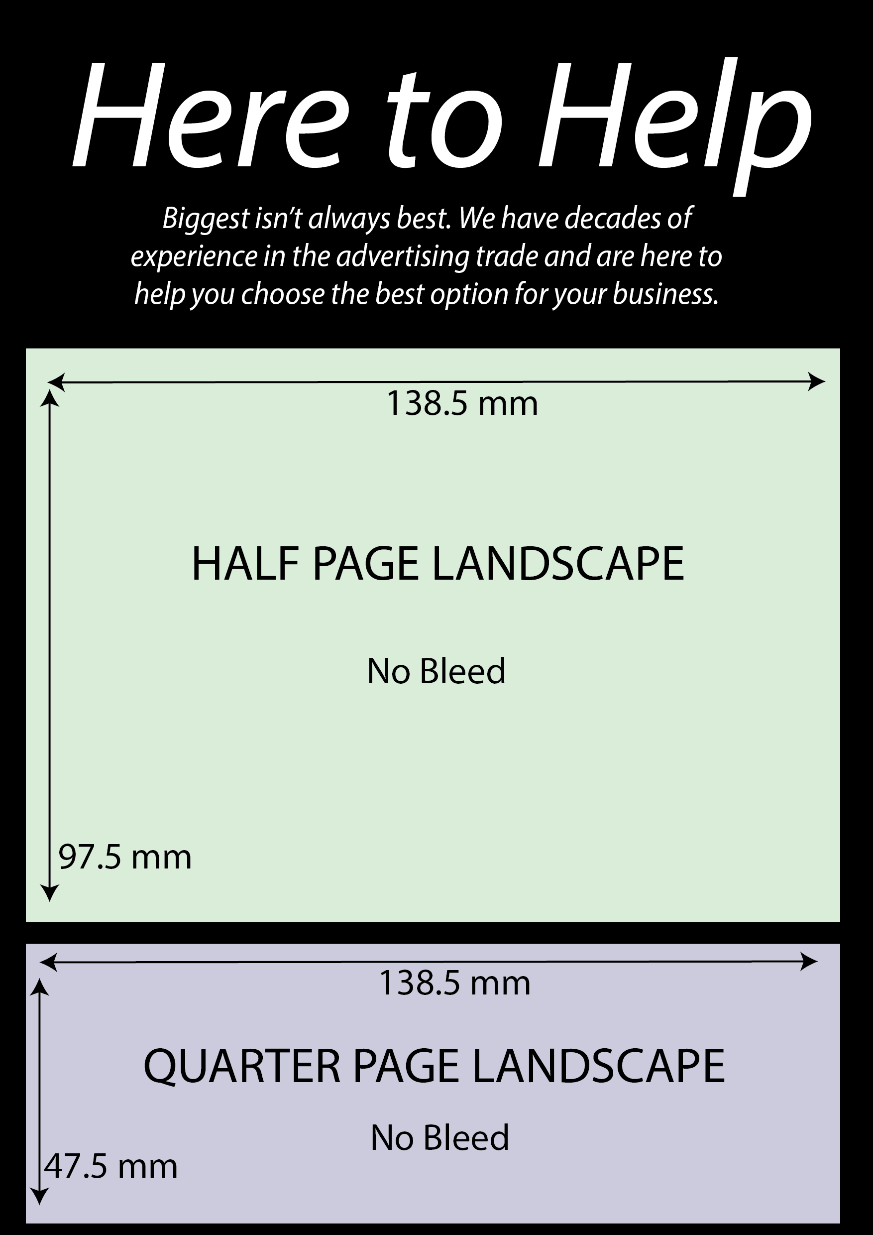
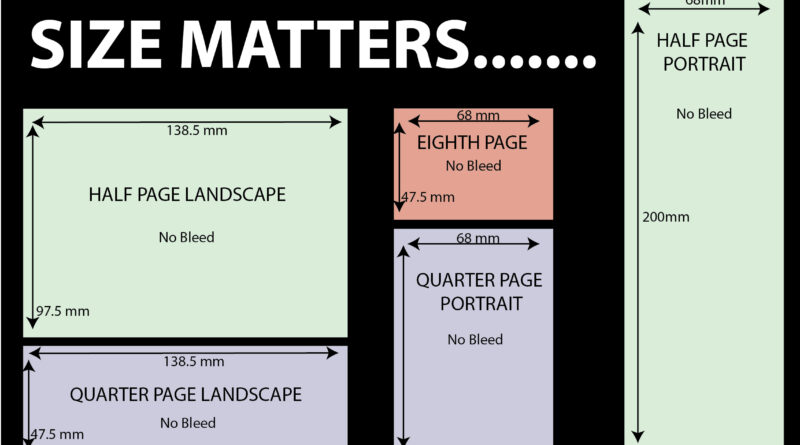
From a design point of view, getting the right size and shaped advert is also important. Our Quarter Page adverts and our Half Page adverts come both as a portrait or landscape option. You can see these options on the next page but you may want to consider which one fits your business.
Leon says that “the vast majority of quarter page adverts that we get in are portrait. While the half pages that we get in are landscape. Generally, I think these work best, but it can depend on the logo and what the advertiser is trying to say. If you have a square logo then that can be tricky to fit in on a quarter page portrait for example, as you either need to make it very small and have some awkward space either side of it or you go for the full width and it can take up most of the space.”
“The same can be the case with a square advert on a landscape half page, in which case, having a large logo in a half page portrait with ample space below can look good and is a better option. If the logo is more of an elongated one, then the opposite can be the case.”
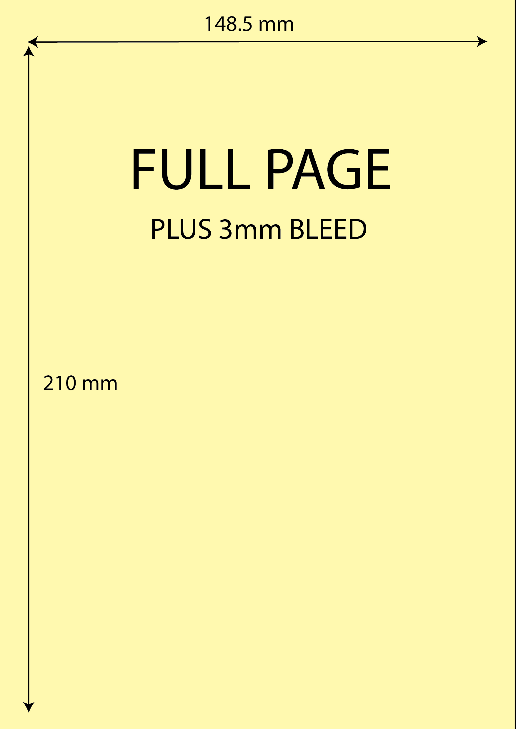
You can view our different sizes below:-


Where next?
Celebrating 35 Years.
What area to choose.
Free design & Tips
Prices


